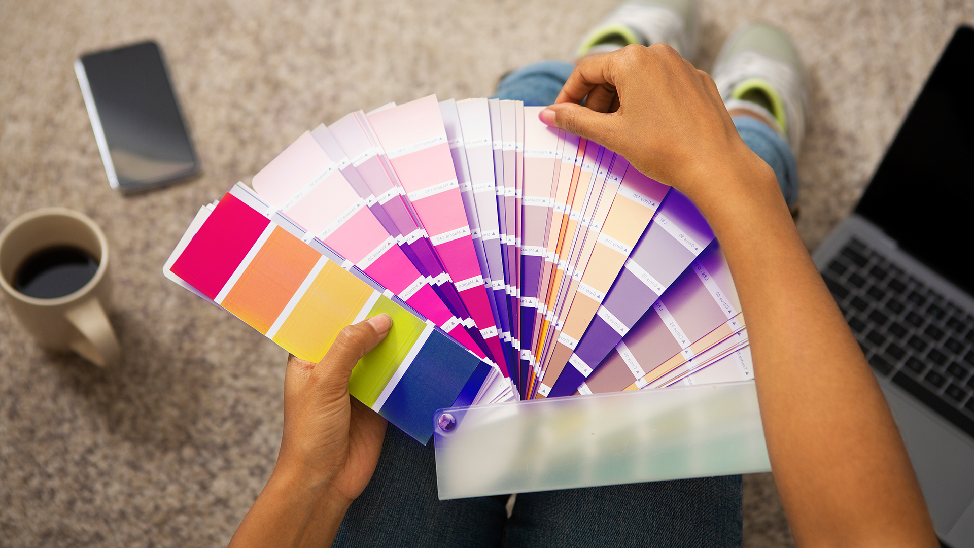
Choosing a paint colour should be exciting — but for most GTA homeowners, it turns into a stressful weekend of staring at tiny colour swatches and second-guessing every decision.
You pick what looks like a beautiful warm beige at the store. You bring it home, paint the wall, and it somehow looks orange. Sound familiar?
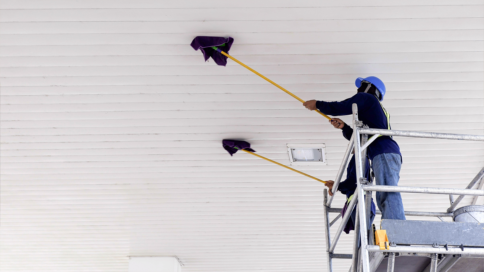
You’re not alone. Our team at Golden Star Painting has helped over 1,250 homeowners across Brampton, Mississauga, Toronto, and the rest of the GTA pick colours they genuinely love — and we’ve seen every colour mistake in the book. This guide is everything we’ve learned, written in plain English so you can walk into your next project with confidence.
Start Here: Lighting Changes Everything
Before you even look at a colour chip, understand this one thing — the same colour looks completely different depending on the light in your room.
A soft grey that looks elegant in a south-facing living room in Mississauga can look cold and dull in a north-facing bedroom that barely gets sunlight. This is the number one reason homeowners end up unhappy with their colour choice.
What to do: – Buy a small sample pot (Benjamin Moore and Sherwin-Williams both sell them for under $10) – Paint a 30cm x 30cm patch on two or three different walls in the same room – Look at it in the morning, at noon, and in the evening with the lights on
If you still like it after that test — go for it. If something feels off, it’s worth the $10 to try another shade before you commit to an entire room.
Room by Room: What Actually Works in GTA Homes
Living Room
This is usually the largest, most-used room in the house, so the colour has to work hard. It needs to feel welcoming when guests arrive and still feel comfortable on a quiet Sunday morning.
In 2026, warm earthy tones are leading the way across GTA homes. Think soft greige (a blend of grey and beige), warm off-whites, and muted sage greens. These tones work especially well in open-concept layouts — which are common in newer Brampton and Mississauga builds — because they flow naturally from room to room without clashing. If you’re refreshing your living space, our interior painting service covers everything from walls and ceilings to trim and doors.
What our painters recommend: Sherwin-Williams Accessible Beige or Benjamin Moore Pale Oak for a timeless, versatile base. If you want a little more personality, a soft sage green accent wall adds depth without overwhelming the room.
What to avoid: Cold, blue-toned greys. These were popular five or six years ago but look dated in most GTA homes now, and they tend to make a room feel chilly in winter — which is the last thing you want from November to March
Bedrooms
A bedroom colour should help you wind down, not keep you alert. The research on colour psychology is consistent here — cooler, softer tones genuinely help people relax.
Soft blues, muted greens, and warm lavenders are all strong bedroom choices. For smaller bedrooms, lighter shades of these colours keep the room from feeling cramped. For larger master bedrooms, you can afford to go a shade or two deeper for a more luxurious feel.
A popular choice we’re seeing a lot in 2026 across GTA homes is Benjamin Moore’s Silhouette — a charcoal-espresso shade used on a single feature wall behind the bed. Paired with off-white walls on the remaining three sides, it creates a high-end look without making the room feel dark.
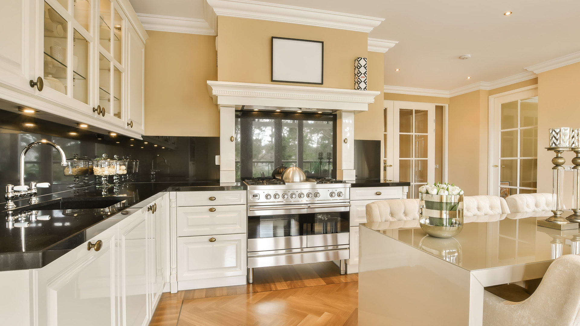
Kitchen
Kitchens are tricky because there’s so much going on visually — countertops, cabinet colours, appliances, backsplash tiles. The wall colour needs to sit behind all of that without competing.
If your cabinets are white or off-white (very common in GTA homes), you have a lot of flexibility. Soft greens, warm whites, and even a muted terracotta can all work beautifully. If your cabinets are already a strong colour, keep the walls as neutral as possible.
One thing worth knowing: if you’re planning to repaint your kitchen cabinets — which many Brampton and Mississauga homeowners are doing instead of replacing them — choose your cabinet colour first, then work the wall colour around it. It’s much easier to match a wall to a cabinet than the other way around
Bathrooms
Small rooms, big impact. Because bathrooms are typically small, even a slightly wrong colour feels very wrong.
Light, airy colours make bathrooms feel larger and cleaner — soft whites, light blues, and pale greens are safe choices that photograph well and age gracefully. If you want to make a bold statement, a deep navy or forest green on all four walls of a powder room can look stunning, but it works best when the trim and fixtures are crisp white to balance it out.
The 60-30-10 Rule: A Simple Formula for Any Room
If you’re not sure how to combine colours in a room without it looking like a paint store exploded, use this rule that interior designers swear by:
- 60% — Your dominant colour (main walls)
- 30% — Your secondary colour (trim, a feature wall, large furniture)
- 10% — Your accent colour (cushions, artwork, a lamp, door hardware)
This works in any room. A living room with warm greige walls (60%), white trim and a charcoal sofa (30%), and some terracotta cushions (10%) will look pulled together every single time.
Should You Follow 2026 Colour Trends?
Short answer — use trends as inspiration, not as a rulebook.
The leading paint brands have released their 2026 colours of the year: Benjamin Moore chose Silhouette (a deep charcoal espresso), Sherwin-Williams went with Universal Khaki (a warm sandy neutral), and Behr picked Hidden Gem (a saturated teal that shifts with the light). These are beautiful colours, but whether they’re right for your specific home depends entirely on your layout, lighting, and how long you plan to live there.
If you’re painting to sell your home in the next year or two, stick with warm neutrals — they appeal to the widest pool of buyers and consistently show well in listing photos. Don’t forget the outside either — a fresh exterior painting is the first thing buyers notice and one of the highest-ROI upgrades you can make before listing. If you’re staying put for 10 years, choose what genuinely makes you happy every time you walk in the door.
Not Sure? Get a Free Colour Consultation
Picking the wrong colour is an expensive mistake — not just in wasted paint, but in the time and labour of repainting. That’s why at Golden Star Painting, every estimate we provide across the GTA includes a free colour consultation with our team. Whether it’s interior painting, exterior painting, or kitchen cabinet painting — we help you choose the right colour before a single brush touches your wall.
We’ll look at your actual space — the lighting, the flooring, the furniture — and give you honest, specific recommendations based on what we’ve seen work in hundreds of GTA homes.
Ready to Get Started?
Get your free estimate and colour consultation today
Join 1,250+ homeowners across Brampton and the GTA who trusted Golden Star Painting. Get your free estimate today — no obligation, no hidden fees, just great painting.